🔓 vue-password-strength-meter
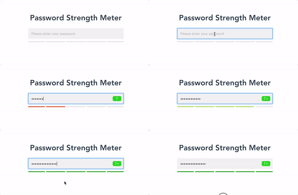
Interactive password strength meter based on zxcvbn for vue.js

📺 Demo
🔧 Install
yarn add vue-password-strength-meter zxcvbn
👈 Usage
<template>
  <password v-model="password"/>
</template>

<script>
  import Password from 'vue-password-strength-meter'
  export default {
    components: { Password },
    data: () => ({
      password: null
    })
  }
</script>
👈 With events
<template>
  <password
    v-model="password"
    :toggle="true"
    @score="showScore"
    @feedback="showFeedback"
  />
</template>

<script>
  import Password from 'vue-password-strength-meter'
  export default {
    components: { Password },
    data: () => ({
      password: null
    }),
    methods: {
      showFeedback ({suggestions, warning}) {
        console.log('🙏', suggestions)
        console.log('⚠', warning)
      },
      showScore (score) {
        console.log('💯', score)
      }
    }
  }
</script>
With custom input
<template>
  <div>
    <input type="password" v-model="password">
    <password v-model="password" :strength-meter-only="true"/>
  </div>
</template>

<script>
  import Password from 'vue-password-strength-meter'
  export default {
    components: { Password },
    data: () => ({
      password: null
    })
  }
</script>
Props
| Prop | Type | Default Value | Description |
|---|---|---|---|
| secureLength | Number | 7 | password min length |
| badge | Boolean | true | display password count badge |
| toggle | Boolean | false | show button to toggle password visibility |
| showPassword | Boolean | false | If you are not using the toggle button you can directly show / hide the password with this prop |
| defaultClass | String | Password__field | input field class |
| disabledClass | String | Password__field--disabled | disabled input field class |
| errorClass | String | Password__badge--error | error class for password count badge |
| successClass | String | Password__badge--success | success class for password count badge |
| strengthMeterClass | String | Password__strength-meter | strength-meter class |
| strengthMeterFillClass | String | Password__strength-meter--fill | strength-meter class for individual data fills |
| showStrengthMeter | Boolean | true | Hide the Strength Meter if you want to implement your own |
| strengthMeterOnly | Boolean | false | Hides the built-in input if you want to implement your own |
| labelHide | String | 'Hide Password' | Label for the hide icon |
| labelShow | String | 'Show Password' | Label for the show icon |
| userInputs | Array | empty array | Array of strings that zxcvbn will treat as an extra dictionary |
| referenceValue | String | 'input' | Prop to change the ref of the input. This way you can have the input outside of the component. |
Events
Show / Hide Password
@showwill be emitted if showing the password@hidewill be emitted if hiding the password@scorewill return the zxcvbn score (Integer from 0-4) [ℹ] (https://github.com/dropbox/zxcvbn#usage)@feedbackwill return an zxcvbn feedback object withsuggestionandwarning
💅 Customizing
You can customize the styling of the input field, badge and strength-meter by passing your own css classes
to defaultClass, strengthMeterClass etc.
Build Setup
# install dependencies
npm install

# serve with hot reload at localhost:8080
npm run dev

# build for production with minification
npm run build

# run unit tests
npm run unit

# run all tests
npm test
For detailed explanation on how things work, checkout the guide and docs for vue-loader.


