React Seven-Segment Display Component
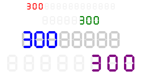
A customizable seven-segment display component for React and TypeScript. Perfect for displaying numeric and alphanumeric values in a digital clock, scoreboard, or retro-style interface.
| left-aligned (default) | right-aligned |
|---|---|
 |
 |


Installation
You can install this package using npm or yarn:
npm install react-ts-seven-segment-displayor
yarn add react-ts-seven-segment-displayUsage
Import the component and use it in your React project:
import React from "react";
import SevenSegmentDisplay from "react-ts-seven-segment-display";

const App = () => {
  return (
    <div>
      <SevenSegmentDisplay value={1234} height={80} color="red" autoGrow />
    </div>
  );
};

export default App;
Props
| Prop | Type | Default | Description |
|---|---|---|---|
value |
number | string | null |
null |
The value to display. |
height |
number |
64 |
Height of the segment display. |
segmentSize |
number |
8 |
Number of segments to display. |
bgColor |
string |
"#F2F2F2" |
Background color of inactive segments. |
color |
string |
"#545C6C" |
Color of active segments. |
spacing |
number |
8 |
Spacing between segments. |
startFromEnd |
boolean |
false |
Align numbers to the end of the display. |
autoGrow |
boolean |
false |
Automatically adjust segment size based on input length. |
Supported Characters
The following characters are supported for display:
0 1 2 3 4 5 6 7 8 9 A B C D E F G H I J K L M N O P Q R S T U V W X Y Z - _ = [ ]License
This project is licensed under the ISC License.
Author
Created by begenchmyratmeredamanov.