 react-native-gradient-text
react-native-gradient-texts
About
react-native-gradient-texts is React Native component for different Gradient styled Texts for iOS & Android.
Installation
Install library
from npm
npm install react-native-gradient-textsfrom yarn
yarn add react-native-gradient-textsMake sure that you have installed the
react-native-svglibarary.Link native code
cd ios && pod install
Example
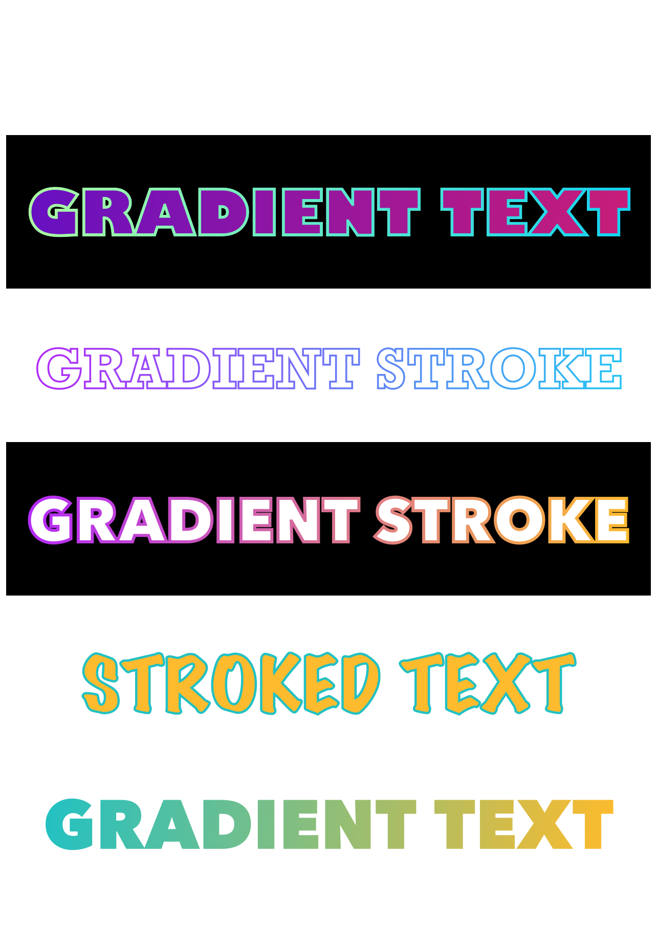
- Gradient Text with Gradient Border
import React from "react";
import { StyleSheet, SafeAreaView } from "react-native";
import GradientText from "react-native-gradient-texts";

const App = () => {
  return (
    <SafeAreaView style={styles.container}>
      <GradientText
        text={"GRADIENT TEXT"}
        fontSize={40}
        isGradientFill
        isGradientStroke
        strokeWidth={2}
        style={{ backgroundColor: "black" }}
        width={420}
        locations={{ x: 210, y: 65 }}
        borderColors={["#adfda2", "#11d3f3"]}
        gradientColors={["#6710c2", "#c81d77"]}
        fontFamily={"Gill Sans"}
      />
    </SafeAreaView>
  );
};

export default App;

const styles = StyleSheet.create({
  container: {
    flex: 1,
    alignItems: "center",
    justifyContent: "center",
  },
});- Gradient Stroke Text
<GradientText
    text={'GRADIENT STROKE'}
    fontSize={35}
    isGradientStroke
    width={420}
    locations={{x: 210, y: 65}}
    strokeWidth={1.2}
    fontFamily={'Rockwell'}
/>
<GradientText
    text={'GRADIENT STROKE'}
    fontSize={40}
    style={{backgroundColor: 'black'}}
    isGradientStroke
    strokeWidth={2}
    width={420}
    locations={{x: 210, y: 65}}
    borderColors={['#b429f9', '#fdbb2d']}
/>- Bordered Text
<GradientText
  text={"STROKED TEXT"}
  fontSize={50}
  fillColor={"#fdbb2d"}
  width={420}
  locations={{ x: 210, y: 75 }}
  strokeWidth={1.5}
  strokeColor={"#22c1c3"}
  fontFamily={"Marker Felt"}
/>- Simple Gradient Text
<GradientText
  text={"GRADIENT TEXT"}
  fontSize={45}
  width={420}
  locations={{ x: 210, y: 65 }}
  isGradientFill
  gradientColors={["#22c1c3", "#fdbb2d"]}
/>
Props
| Props | Params Type | Default | Description |
|---|---|---|---|
| text (Required) | String | '' | Text to be display |
| height | Number | 100 | SVG height |
| width | Number | 300 | SVG width |
| gradientColors | [String, String] | ['#810955', '#533483'] | Colors for text Gradient |
| borderColors | [String, String] | ['#b429f9', '#26c5f3'] | Colors for text Border/Stroke |
| locations | {x: Number; y: Number} | {x: 150, y: 80} | Distance on x, y axis |
| start | {x: Number; y: Number} | {x: 0, y: 0} | Start of the gradient on the x, y axis |
| end | {x: Number; y: Number} | {x: 1, y: 1} | End of the gradient on the x, y axis |
| isGradientFill | Boolean | false | For gradient text |
| fillColor | String | '#FFFFFF' | For single colored text |
| isGradientStroke | Boolean | false | For gradient Text Border |
| strokeColor | String | '#000000' | For simple text border |
| strokeWidth | Number | 0 | Text border Width |
| fontSize | Number | 18 | Customize font size |
| fontFamily | String | 'Avenir Next' | Customize font family |
| fontWeight | String or Number | 900 | Customize font weight |
| style | ViewStyle | {} | Styling for container view |
Author
Drashti Sabhaya
License
This project is under the MIT license. See the LICENSE to learn more.
Contact!