 dave-b-b
React Achievements
A flexible and extensible achievement system for React applications. This package provides the foundation for implementing achievements in React applications with support for multiple state management solutions including Redux, Zustand, and Context API. Check the stories/examples directory for implementation examples with different state management solutions.
Installation
npm install react-achievements react react-dom react-confetti react-modal react-toastify react-useNote: React and React DOM should be version 16.8.0 or higher. If you already have some of these packages installed, npm will skip them automatically.
Quick Start
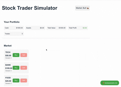
Here's a complete working example that shows automatic notifications and achievement tracking:
import React, { useState } from 'react';
import {
  AchievementProvider,
  useAchievements,
  BadgesButton,
  BadgesModal
} from 'react-achievements';

// Define a simple achievement
const achievementConfig = {
  score: [{
    isConditionMet: (value: number) => value >= 100,
    achievementDetails: {
      achievementId: 'score_100',
      achievementTitle: 'Century!',
      achievementDescription: 'Score 100 points',
      achievementIconKey: 'trophy'
    }
  }]
};

// Demo component with all essential features
const DemoComponent = () => {
  const [isModalOpen, setIsModalOpen] = useState(false);
  const { update, achievements, reset } = useAchievements();

  return (
    <div>
      <h1>Achievement Demo</h1>

      {/* Button to trigger achievement */}
      <button onClick={() => update({ score: 100 })}>
        Score 100 points
      </button>

      {/* Reset button */}
      <button onClick={reset}>
        Reset Achievements
      </button>

      {/* Shows unlocked achievements count */}
      <p>Unlocked: {achievements.unlocked.length}</p>

      {/* Floating badges button */}
      <BadgesButton
        position="bottom-right"
        onClick={() => setIsModalOpen(true)}
        unlockedAchievements={achievements.unlocked}
      />

      {/* Achievement history modal */}
      <BadgesModal
        isOpen={isModalOpen}
        onClose={() => setIsModalOpen(false)}
        achievements={achievements.unlocked}
      />
    </div>
  );
};

// Root component with provider
const App = () => {
  return (
    <AchievementProvider
      achievements={achievementConfig}
      storage="local"
    >
      <DemoComponent />
    </AchievementProvider>
  );
};

export default App;
When you click "Score 100 points":
- A toast notification appears
- Confetti animation plays
- The achievement is stored and visible in the badges modal
- The badges button updates to show the new count
State Management Options
This package includes example implementations for different state management solutions in the stories/examples directory:
- Redux: For large applications with complex state management needs
- Zustand: For applications needing a lightweight, modern state solution
- Context API: For applications preferring React's built-in solutions
See the examples directory for detailed implementations and instructions for each state management solution.
Features
- Framework-agnostic achievement system
- Customizable storage implementations
- Built-in local storage support
- Customizable UI components
- Toast notifications
- Confetti animations
- TypeScript support
Achievement Notifications & History
The package provides two ways to display achievements to users:
Automatic Notifications
When an achievement is unlocked, the system automatically:
- Shows a toast notification in the top-right corner with the achievement details
- Plays a confetti animation to celebrate the achievement
These notifications appear immediately when achievements are unlocked and require no additional setup.
Achievement History
To allow users to view their achievement history, the package provides two essential components:
BadgesButton: A floating button that shows the number of unlocked achievements<BadgesButton position="bottom-right" // or "top-right", "top-left", "bottom-left" onClick={() => setIsModalOpen(true)} unlockedAchievements={achievements.unlocked} />BadgesModal: A modal dialog that displays all unlocked achievements with their details<BadgesModal isOpen={isModalOpen} onClose={() => setIsModalOpen(false)} achievements={achievements.unlocked} icons={customIcons} // Optional custom icons />
These components are the recommended way to give users access to their achievement history. While you could build custom UI using the useAchievements hook data, these components provide a polished, ready-to-use interface for achievement history.
Basic Usage
import { AchievementProvider, useAchievements } from 'react-achievements';
// For specific state management implementations:
// import { AchievementProvider, useAchievements } from 'react-achievements/redux';
// import { AchievementProvider, useAchievements } from 'react-achievements/zustand';
// import { AchievementProvider, useAchievements } from 'react-achievements/context';

// Define your achievements with various data types and conditions
const achievements = {
  // Numeric achievements with thresholds
  score: {
    100: {
      title: 'Century!',
      description: 'Score 100 points',
      icon: 'trophy'
    },
    500: {
      title: 'Half a Thousand!',
      description: 'Score 500 points',
      icon: 'gold',
      condition: (value) => value >= 500
    }
  },

  // Boolean achievements
  completedTutorial: {
    true: {
      title: 'Tutorial Master',
      description: 'Complete the tutorial',
      icon: 'book'
    }
  },

  // String-based achievements
  characterClass: {
    'wizard': {
      title: 'Arcane Scholar',
      description: 'Choose the wizard class',
      icon: 'wand'
    },
    'warrior': {
      title: 'Battle Hardened',
      description: 'Choose the warrior class',
      icon: 'sword'
    }
  },

  // Array-based achievements
  collectedItems: {
    ['sword', 'shield', 'potion']: {
      title: 'Fully Equipped',
      description: 'Collect all essential items',
      icon: 'backpack',
      condition: (items) => ['sword', 'shield', 'potion'].every(item => items.includes(item))
    }
  },

  // Object-based achievements
  playerStats: {
    { strength: 10, intelligence: 10 }: {
      title: 'Balanced Warrior',
      description: 'Achieve balanced stats',
      icon: 'scale',
      condition: (stats) => stats.strength === 10 && stats.intelligence === 10
    }
  },

  // Time-based achievements
  playTime: {
    3600: {
      title: 'Dedicated Player',
      description: 'Play for 1 hour',
      icon: 'clock',
      condition: (seconds) => seconds >= 3600
    }
  },

  // Combination achievements
  combo: {
    { score: 1000, level: 5 }: {
      title: 'Rising Star',
      description: 'Reach level 5 with 1000 points',
      icon: 'star',
      condition: (metrics) => metrics.score >= 1000 && metrics.level >= 5
    }
  }
};

// Create your app component
const App = () => {
  return (
    <AchievementProvider
      achievements={achievements}
      storage="local" // or "memory" or custom storage
    >
      <Game />
    </AchievementProvider>
  );
};

// Use achievements in your components
const Game = () => {
  const { update, achievements } = useAchievements();

  const handleScoreUpdate = (newScore: number) => {
    update({ score: newScore });
  };

  return (
    <div>
      <h1>Game</h1>
      <p>Unlocked Achievements: {achievements.unlocked.length}</p>
      <button onClick={() => handleScoreUpdate(100)}>
        Score 100 points
      </button>
    </div>
  );
};
Default Icons
The package comes with a comprehensive set of default icons that you can use in your achievements. These are available through the defaultAchievementIcons export:
import { AchievementProvider, defaultAchievementIcons } from 'react-achievements-core';

// Example achievement configuration using default icons
const achievementConfig = {
  pageViews: [
    {
      isConditionMet: (value) => value >= 5,
      achievementDetails: {
        achievementId: 'views-5',
        achievementTitle: 'Getting Started',
        achievementDescription: 'Viewed 5 pages',
        achievementIconKey: 'firstStep' // This will use the 👣 emoji from defaultAchievementIcons
      }
    }
  ]
};

// Create your app component
const App = () => {
  return (
    <AchievementProvider
      achievements={achievementConfig}
      // The provider automatically uses defaultAchievementIcons
    >
      <Game />
    </AchievementProvider>
  );
};
Custom Icons
You can also provide your own custom icons that will override or extend the default ones:
import { AchievementProvider, defaultAchievementIcons } from 'react-achievements-core';

// Create custom icons by extending the defaults
const customIcons = {
  ...defaultAchievementIcons, // Include all default icons
  levelUp: '🚀', // Override the default for 'levelUp'
  myCustomIcon: '💻' // Add a new icon not in the defaults
};

const App = () => {
  return (
    <AchievementProvider
      achievements={achievementConfig}
      icons={customIcons} // Pass your custom icons to the provider
    >
      <Game />
    </AchievementProvider>
  );
};
Available Icons
The defaultAchievementIcons includes icons in these categories:
- General Progress & Milestones (levelUp, questComplete, etc.)
- Social & Engagement (shared, liked, etc.)
- Time & Activity (activeDay, streak, etc.)
- Creativity & Skill (artist, expert, etc.)
- Achievement Types (bronze, silver, gold, etc.)
- Numbers & Counters (one, ten, hundred, etc.)
- Actions & Interactions (clicked, discovered, etc.)
- Placeholders (default, loading, error, etc.)
- Miscellaneous (trophy, star, gem, etc.)
Custom Storage
You can implement your own storage solution by implementing the AchievementStorage interface:
import { AchievementStorage } from 'react-achievements-core';

class CustomStorage implements AchievementStorage {
  getMetrics() {
    // Your implementation
  }

  setMetrics(metrics) {
    // Your implementation
  }

  getUnlockedAchievements() {
    // Your implementation
  }

  setUnlockedAchievements(achievements) {
    // Your implementation
  }

  clear() {
    // Your implementation
  }
}

// Use your custom storage
const App = () => {
  return (
    <AchievementProvider
      achievements={achievements}
      storage={new CustomStorage()}
    >
      <Game />
    </AchievementProvider>
  );
};
Styling
You can customize the appearance of the achievement components:
const App = () => {
  return (
    <AchievementProvider
      achievements={achievements}
      theme={{
        colors: {
          primary: '#ff0000',
          background: '#f0f0f0'
        },
        position: 'top-right'
      }}
    >
      <Game />
    </AchievementProvider>
  );
};
API Reference
AchievementProvider Props
| Prop | Type | Description |
|---|---|---|
| achievements | AchievementConfig | Achievement configuration object |
| storage | 'local' | 'memory' | AchievementStorage | Storage implementation |
| theme | ThemeConfig | Custom theme configuration |
| onUnlock | (achievement: Achievement) => void | Callback when achievement is unlocked |
useAchievements Hook
Returns an object with:
update: Function to update achievement metricsachievements: Object containing unlocked and locked achievementsreset: Function to reset achievement storage
License
MIT