 kietpt2003
React Native Core UI
Accelerate your React Native development with a rich set of customizable UI components built for consistency and performance. Designed to streamline layout and styling, these components are ideal for building modern, responsive, and scalable interfaces across all screens. Seamlessly adaptable and theme-ready for effortless branding.
[!TIP]
- My info: https://github.com/kietpt2003
- Due to some TypeScript issues that lead to unable to suggest code correctly.
- But we have try our best, so now if you using our
sub path(Example:'/utils','/themes'), you must initialize the import first, for the auto suggestion.
Table of Contents
- Installation
- Custom components
- Custom hooks
- ScrollPercentage (Future)
- Color pallete
- Font size template
- Scaling Function
- Resolution Function
- Converter and format
- Debounce
- Others
Installation
Please install required packages:
- @react-native-camera-roll/camera-roll: ">=7.10.0" => For access devices media support GalleryBottomSheet & useGalleryAssets.
Note: This package should be upper then 7.10.0. Due to error in v7.7.0 and lowwer version this package won't work correct in GalleryBottomSheet & useGalleryAssets - react-native-device-info: ">=8.1.3", => Use for knowing device is table or not
- react-native-gesture-handler: ">=2.9.0", => Support handling gesture for GalleryBottomSheet
- react-native-reanimated: ">=2.8.0", => For handling package animation
- react-native-svg: ">=12.1.1", => For custom svg
- react-native-vector-icons: ">=8.1.0", => Please config correct installation guidline for not handling icon error
Custom components
Text
Text component for displaying text with custom styles and loading state. This component also have its own view and can easily be customized.
Props
| Prop | Type | Default | Description |
|---|---|---|---|
style |
StyleProp<TextStyle> |
None | Style of the Text component, just like Text Style Props |
color |
ColorValue |
"black" |
Color of the text |
bold |
boolean |
false |
Choose to bold the text |
children |
React.ReactNode |
None | Provide the text string or another Text component |
load |
boolean |
false |
Waiting before show Text |
styleView |
StyleProp<ViewStyle> |
None | For custom a View outside Text component |
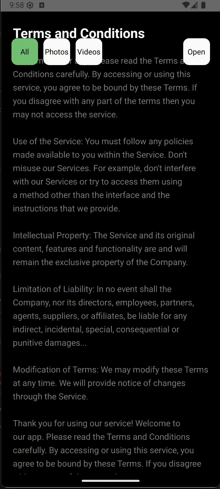
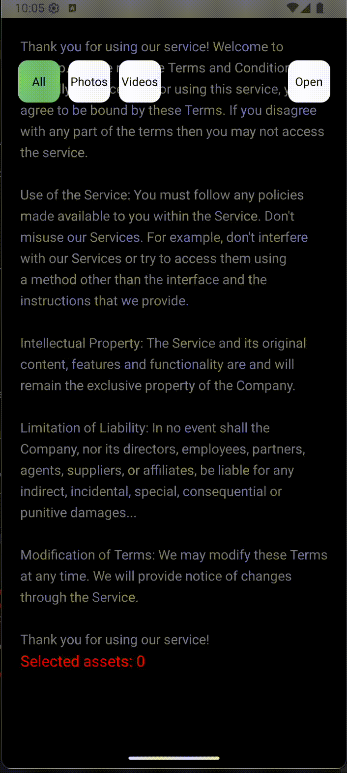
GalleryBottomSheet
A bottom sheet component for displaying a gallery of images and videos. It allows users to select multiple assets and provides a filter for albums.

Permissions
Android
Add this permission to your AndroidManifest.xml:
<uses-permission android:name="android.permission.READ_EXTERNAL_STORAGE" android:maxSdkVersion="32"/>
<uses-permission android:name="android.permission.WRITE_EXTERNAL_STORAGE" android:maxSdkVersion="32"/>
<uses-permission android:name="android.permission.READ_MEDIA_IMAGES" />
<uses-permission android:name="android.permission.READ_MEDIA_VIDEO" />
iOS
Add this perission to your Info.plist:
<key>NSPhotoLibraryUsageDescription</key>
<string>App request permission for access your gallery</string>
<key>NSPhotoLibraryAddUsageDescription</key>
<string>App request permission for create assets in your gallery</string>
Props
| Prop | Type | Default | Description |
|---|---|---|---|
isOpen |
boolean |
false |
Define to open gallery or not. |
openHeight |
number |
ScreenHeight / 2 |
Define the position to open gallery. Note: y coordinate of the top of the bottom sheet from the top of the screen |
closeHeight |
number |
ScreenHeight |
Define the position when closed gallery. Note: y coordinate of the top of the bottom sheet from the top of the screen |
maxHeight |
number |
0 |
Define the maximum y coordinate that gallery should snapped at after finger release. Note: y coordinate of the top of the bottom sheet from the top of the screen |
headerBarColor |
ColorValue |
"#FFFFFF" |
Define the background color of the header bar. Note: Full control over the look at each position. Whether it's beautiful or ugly is up to you. |
barIconColor |
ColorValue |
"#000000" |
Define the header bar icon color. Note: Full control over the look at each position. Whether it's beautiful or ugly is up to you. |
headerTitleStyle |
Pick<TextStyle, "color" | "fontFamily" | "fontWeight"> |
{ color: '#000000' } |
Define styling for the header title. Only supports: color, fontFamily, fontWeight. |
headerTitle |
string |
'Tất cả ảnh' |
Define the header title. Will be overridden by folder name when one is selected. Will be truncated if too long. |
headerTitleIconColor |
ColorValue |
"#000000" |
Define the header title icon color. |
backgroundColor |
ColorValue |
"#FFFFFF" |
Define the background color of the gallery bottom sheet. |
emptyGalleryMsg |
string |
'Không có hình ảnh để hiển thị' |
Message shown when there are no media items available. Please provide meaningful content. |
emptyGalleryMsgStyle |
Pick<TextStyle, "color" | "fontFamily" | "fontWeight"> |
{ color: '#000000' } |
Define styling for the empty message. Only supports: color, fontFamily, fontWeight. See example |
videoIconStyle |
{ circleStyle?: CircleStyleProps; polygonStyle?: CircleStyleProps } |
See example | Define styling for the video icon shown for video items. Full control over circle and polygon styles. |
albumItemStyle |
AlbumFilterStyleProps |
{ titleColor: '#000000', countColor: '#A0A0A0' } |
Define style for album filter items. Full control over title and count colors. See example |
assetType |
'All' | 'Photos' | 'Videos' |
'All' |
Asset types to display. Can be dynamically changed with setState. |
maxSelectable |
number |
5 |
Max number of items selectable. Min: 0, Max: 10. Large values may cause performance issues. |
onSelectedAssetsChange |
(assets: PhotoIdentifier[]) => void |
undefined |
Define function for handling selected assets data. This function will be called when the user select an asset. |
headerTitleStyle
Only support: color, fontFamily, fontWeight.
  import { GalleryBottomSheet, Text } from '@kietpt2003/react-native-core-ui';

  <GalleryBottomSheet
    isOpen={isOpen}
    ...
    headerTitleStyle={{
      color: '#000000',
      fontFamily: 'Arial',
      fontWeight: 400,      // Correct ✅
      fontSize: 20          // Wrong => Unsupport ❌
    }}
    ...
  />
videoIconStyle
Only support: fill, stroke, strokeWidth.
For the strokeWidth, we accept value start from scale(5) to scale(8)
  import { GalleryBottomSheet, Text } from '@kietpt2003/react-native-core-ui';

  <GalleryBottomSheet
    isOpen={isOpen}
    ...
    videoIconStyle={{
      circleStyle: {
        fill: 'rgba(0, 0, 0, 0.5)',
        stroke: 'black',
        strokeWidth: 7
      },
      polygonStyle: {
        fill: 'rgba(0, 0, 0, 0.5)',
        stroke: 'black',
        strokeWidth: 7
      },
    }}
    ...
  />
albumItemStyle
Only support: titleColor, countColor.
  import { GalleryBottomSheet, Text } from '@kietpt2003/react-native-core-ui';

  <GalleryBottomSheet
    isOpen={isOpen}
    ...
    albumItemStyle={{
      titleColor: '#000000',
      countColor: '#A0A0A0'
    }}
    ...
  />
ScrollPercentage
ScrollPercentage is a component that displays a loading indicator with a percentage value. It can be customized with different shapes (circle or square), colors, and gradients.
Props
| Prop | Type | Default | Description |
|---|---|---|---|
hide |
boolean |
false |
Define to show or hide the loading figure. |
percent |
number |
0 |
Please provide the percent for calculate the loading percentage. |
size |
number |
60 |
Provide the size for the loading figure. |
borderRadius |
number |
45 |
The border radius of the square figure. Just apply with square fiugre only. |
backgroundColor |
ColorValue |
none |
The inline color of the loading figure before the loading start. |
strokeEmptyColor |
ColorValue |
#FFFFFF |
The stroke color while the percent is 0. |
fill |
ColorValue |
#FFFFFF |
The fill of the loading figure. Can be a single color or an array of colors. |
gradientDirection |
GradientDirection |
horizontal |
The gradient direction of the fill. This property is only affected when the fill is an array of colors. The gradient direction can be 'horizontal', 'vertical', or 'diagonal'. |
checkColor |
ColorValue |
#000000 |
The color of the check mark. |
Example
  import { ScrollPercentage } from '@estuary/rn-core-ui';
    const MyComponent = () => {
    const [scrollPercent, setScrollPercent] = React.useState(0);
    const [isOpen, setIsOpen] = React.useState(false);
    return (
      <ScrollPercentage
        hide={isOpen}
        size={60}
        percent={scrollPercent}
        backgroundColor="red"
        strokeEmptyColor="blue"
        fill="green" // Can be a single color or an array of colors
        gradientDirection="horizontal" // Choose the gradient direction of the fill
        checkColor="yellow" // Color of the check mark
        animateSpeed={200} // Animation speed in milliseconds when showing/hiding the loading figure
        figure="circle" // Choose between 'circle' or 'square'
        startPosition="top-left" // Only for square figure
        borderRadius={45} // Only for square figure
      />
    );
  }
Custom hooks
useGalleryAssets(defaultAssetType?: AssetType)
You can use this hook for accessing device's assets or requesting related permission.
Permissions
Android
Add this permission to your AndroidManifest.xml:
<uses-permission android:name="android.permission.READ_EXTERNAL_STORAGE" android:maxSdkVersion="32"/>
<uses-permission android:name="android.permission.WRITE_EXTERNAL_STORAGE" android:maxSdkVersion="32"/>
<uses-permission android:name="android.permission.READ_MEDIA_IMAGES" />
<uses-permission android:name="android.permission.READ_MEDIA_VIDEO" />
iOS
Add this perission to your Info.plist:
<key>NSPhotoLibraryUsageDescription</key>
<string>App request permission for access your gallery</string>
<key>NSPhotoLibraryAddUsageDescription</key>
<string>App request permission for create assets in your gallery</string>
Props
| Prop | Type | Default | Description |
|---|---|---|---|
defaultAssetType |
AssetType |
'All' |
Initiallize the default asset type. |
albums |
Album[] |
[] |
Provide list of albums on current device. |
assets |
Record<string, PhotoIdentifier[]> |
{} |
Provide list of assets on current device grouped by album. |
fullAssets |
PhotoIdentifier[] |
[] |
Provide list of assets on current device. |
loading |
boolean |
false |
Provide loading assets state. |
error |
string |
null |
Provide string error if loading cause any error. |
totalAssets |
number |
0 |
Provide the total assets that has been accessed. |
fullAssetsPagination |
Pagination |
undefined |
Provide the object related for pagination on fullAssets. |
loadFullAssets |
Promise function |
|
Provide function for fecth assets which not grouped by album. Return true if has next page. See example |
loadAssets |
Promise function |
|
Provide function for fecth assets which grouped by album. Return true if has next page. See example |
pagination |
Pagination |
undefined |
Provide the object related for pagination on assets. |
requestPermission |
Promise function |
|
Provide function for request permission. Return true if user provided permission. See example |
checkPermission |
Promise function |
|
Provide function returning if user has provided permission. See example |
hasPermission |
boolean |
false |
Provide a state that keep track user permisison. |
changeAssetType |
function |
|
Provide function changing with asset type that you want to fecth. Please notice that, you should provide video permision if want to access videos. Default type 'All'. See example |
Usage
  import { View, Text } from 'react-native'
  import React from 'react'
  import { useGalleryAssets } from '@kietpt2003/react-native-core-ui';

  const MyComponent = () => {
    const [selectedAlbum, setSelectedAlbum] = React.useState<Album | null>(null);
    const {
        albums,
        fullAssets,
        fullAssetsPagination,
        loadFullAssets,
        totalAssets,
        assets,
        loadAssets,
        pagination,
        requestPermission,
        hasPermission,
        changeAssetType,
    } = useGalleryAssets('All');

    const getSelectedInfo = (item: any) => {
      // Do your own selection logic
    }

    const toggleAsset = (item: any) => {
      // Do your own selection logic
    }

    return (
      <View>
        {(albums.length === 0 || fullAssets.length === 0 || totalAssets == 0) ? (
          <View>
            <Text style={[
              styles.noImage,
              safeEmptyGalleryMsgStyle
            ]}>No assets</Text>
          </View>
        ) : (
        <FlatList
          data={selectedAlbum == null ? fullAssets : assets[selectedAlbum.id]}
          keyExtractor={(item) => item.node.image.uri}
          renderItem={({ item }) => {
            const info = getSelectedInfo(item);
            return (
              <TouchableOpacity
                style={styles.image}
                onPress={() => toggleAsset(item)}
                activeOpacity={0.7}
              >
                <Image
                  source={{ uri: item.node.image.uri }}
                  style={styles.image}
                />
                  {
                    item.node.type === "video/mp4" &&
                    <PlayCircle size={videoIconSize} />
                  }
                  {info.isSelected && (
                    <SelectItem value={info.index + 1} />
                  )}
              </TouchableOpacity>
            )
          }}
          ...
          onEndReached={() => {
            //Load more assets
            if (selectedAlbum == null) {
              loadFullAssets(15, fullAssetsPagination?.endCursor, assetTypeState);
            } else {
              loadAssets(selectedAlbum, 15, pagination[selectedAlbum.id].endCursor, assetTypeState);
            }
          }}
        />
        )}
      </View>
    )
  }

  export default MyComponent
Colors
We provide a variety of palete colors and some shadows!
Usage
  import  { colors } from '@kietpt2003/react-native-core-ui/themes';
  import { StyleSheet } from 'react-native';

  const styles = StyleSheet.create({
    container: {
      flex: 1,
      backgroundColor: colors.black,
    },
  });
Fontsize
We provide variety of fontSize that aldready scaled by our scaleFont API
Usage
  import  { fontSize } from '@kietpt2003/react-native-core-ui/themes';
  import { StyleSheet } from 'react-native';

  const styles = StyleSheet.create({
    text: {
      fontSize: fontSize._16,
    },
  });
Scaling Function
  import { scale, verticalScale, moderateScale } from '@kietpt2003/react-native-core-ui/utils';
  import  { colors, fontSize } from '@kietpt2003/react-native-core-ui/themes'

  const Component = props =>
    <View style={{
      width: scale(30),
      height: verticalScale(50),
      padding: moderateScale(5)
    }}>
      <Text style={{
        fontSize: fontSize._16,
        color: colors.black
      }}>Component</Text>
    </View>;
scale(size: number)
Will return a linear scaled result of the provided size, based on your device's screen width.
Usage
  import  { scale } from '@kietpt2003/react-native-core-ui/utils';
  import { StyleSheet } from 'react-native';

  const styles = StyleSheet.create({
    container: {
      padding: scale(5),
    },
  });
scaleH(size: number)
Will return a linear scaled result of the provided size, based on your device's screen height.
Usage
  import  { scaleH } from '@kietpt2003/react-native-core-ui/utils';
  import { StyleSheet } from 'react-native';

  const styles = StyleSheet.create({
    container: {
      position: 'absolute',
      top: scaleH(5),
    },
  });
moderateScale(size: number, factor?: number)
Sometimes you don't want to scale everything in a linear manner, that's where moderateScale comes in.
The cool thing about it is that you can control the resize factor (default is 0.5).
If normal scale will increase your size by +2X, moderateScale will only increase it by +X, for example:
➡️ scale(10) = 20
➡️ moderateScale(10) = 15
➡️ moderateScale(10, 0.1) = 11
Usage
  import  { moderateScale } from '@kietpt2003/react-native-core-ui/utils';
  import { StyleSheet } from 'react-native';

  const styles = StyleSheet.create({
    container: {
      padding: moderateScale(5),
    },
  });
moderateHeightScale(size: number, factor?: number)
Same as moderateScale, but using scaleH instead of scale.
Usage
  import  { moderateHeightScale } from '@kietpt2003/react-native-core-ui/utils';
  import { StyleSheet } from 'react-native';

  const styles = StyleSheet.create({
    container: {
      padding: moderateHeightScale(5),
    },
  });
scaleFont(size: number)
Will return a linear scaled result of the provided size, based on PixelRatio & scaleAvg. You can use fontSize from /theme instead of using scalefont().
Usage
  import  { scaleFont } from '@kietpt2003/react-native-core-ui/utils';
  import { StyleSheet } from 'react-native';

  const styles = StyleSheet.create({
    text: {
      fontSize: scaleFont(16), // fontSize._16
    },
  });
IPHONE_12_WIDTH
Just a constants that specify iPhone 12 width.
  import { IPHONE_12_WIDTH } from '@kietpt2003/react-native-core-ui/utils';
  console.log(IPHONE_12_WIDTH); // 375
IPHONE_12_HEIGTH
Just a constants that specify iPhone 12 height.
  import { IPHONE_12_HEIGTH } from '@kietpt2003/react-native-core-ui/utils';
  console.log(IPHONE_12_HEIGTH); // 812
Resolution Function
getPaddingTop
Get the top padding based on the device type
- 26 OPPO
- 28 NOKIA
Usage
  import { getPaddingTop } from '@kietpt2003/react-native-core-ui/utils';
  const paddingTop = getPaddingTop();
  console.log("paddingTop:", paddingTop);
getPaddingBottom
Get the bottom padding based on the device type
Usage
  import { getPaddingBottom } from '@kietpt2003/react-native-core-ui/utils';
  const paddingBottom = getPaddingBottom();
  console.log("paddingBottom:", paddingBottom);
isTablet
Check if the device is a tablet
Usage
  import { isTablet } from '@kietpt2003/react-native-core-ui/utils';
  console.log("isTablet", isTablet); // true/false
StylePlatform
Use this function to get the styles based on the device type
@param {Object} styles - StyleProp @param {ViewStyle} styles.tablet - Styles for tablet @param {ViewStyle} styles.phone - Styles for phone
Props
| Prop | Type | Default | Description |
|---|---|---|---|
styles |
StyleProp<any> |
undefined |
Initiallize the styles for table and phone. Its contains 2 fields: tablet & phone. See example |
Usage
  <View style={StylePlatform({
    tablet: styles.containerTablet,
    phone: styles.containerPhone
  })}>
    <Text style={StylePlatform({
      tablet: styles.textTablet,
      phone: styles.textPhone
    })}>
      Hello, Platform!
    </Text>
  </View>
statusBarHeight
statusBarHeight of the device
Usage
  import { statusBarHeight } from '@kietpt2003/react-native-core-ui/utils';
  console.log("statusBarHeight", statusBarHeight);
Converter and format
convertString
This function converts input into a string.
- If the input is null or undefined, it returns an empty string.
- If the input is an object, it returns a stringified version of the object.
- Otherwise, it returns the string representation of the input.
Usage
  import { convertString } from '@kietpt2003/react-native-core-ui/utils';
  const str = convertString(2003); // "2003"
convertNumber
This function converts input into a number.
- If the input is null or undefined, it returns 0.
- If the input is not a number, it returns 0.
- Otherwise, it returns the parsed float value of the input.
Usage
  import { convertNumber } from '@kietpt2003/react-native-core-ui/utils';
  const num = convertNumber("2003"); // 2003
convertSeconds
This function convert seconds to a string in the format "mm:ss".
- If the input is less than 0, it returns "00:00".
- If the input is greater than 3599, it returns "00:00".
Usage
  import { convertSeconds } from '@kietpt2003/react-native-core-ui/utils';
  const time = convertSeconds(123); // "02:03"
formatHour
Function to format seconds into a string in the format "hh:mm:ss".
- If the input is less than 0, it returns "00:00:00".
- If the input is greater than 86399, it returns "00:00:00".
Usage
  import { formatHour } from '@kietpt2003/react-native-core-ui/utils';
  const time = formatHour(3661); // "01:01:01"
fixedDistance
Function to format a distance value.
- If the input is an integer, it returns the integer value.
- If the input is a float, it returns the value formatted to a custom toFixed value decimal places.
- If the input is null or undefined, it returns 0.
Note: The toFixed value should be between 1 and 5, otherwise it defaults to 2.
Usage
  import { fixedDistance } from '@kietpt2003/react-native-core-ui/utils';
  const distance = fixedDistance(123.456); // "123.46"
  const distance2 = fixedDistance(123.4567, 3); // "123.457"
formatMoney
Function to format money values.
Props
| Prop | Type | Default | Description |
|---|---|---|---|
num |
number |
0 |
Define the value need to be format. |
maximumFractionDigits |
number |
0 |
Define the maximum fraction digits. See example |
lang |
string |
en-US |
Define the language. This should be a BCP 47 language tag (e.g., 'en-US', 'vi-VN'). View detail |
lang prop
This is a string that contains a language code and an optional country code, separated by a hyphen.
Structure: "[languageCode]-[countryCode]"
Example: 'en-IN' => en: Language English, IN: Country India
Reference:
Usage
  import { formatMoney } from '@kietpt2003/react-native-core-ui/utils';
  const money = formatMoney(1234567.89); // "1,234,568"
  const money2 = formatMoney(1234567.89, 2); // "1,234,567.89"
  const money3 = formatMoney(1234567.89, 2, 'vi-VN'); // "1.234.567,89"
Debounce
- Creates a debounced function that delays invoking the provided function until after a specified delay in milliseconds has elapsed since the last time the debounced function was invoked.
- The debounced function comes with
cancelandflushmethods to cancel the debounced invocation and to immediately invoke the function, respectively.
Usage
  import { debounce } from '@kietpt2003/react-native-core-ui/utils';
  const onChangeText = debounce(() => {
    console.log('Function executed!');
  }, 1000);

  //Flush case
  const debouncedLog = debounce(logMessage, 2000);
  debouncedLog("Waiting 2s...");
  setTimeout(() => {
    debouncedLog.flush(); // Immediately execute the function
  }, 1000);

  //Cancel case
  debouncedLog("Canceled");
  setTimeout(() => {
    debouncedLog.cancel(); // Don't execute the function
  }, 1000);
Others
cleanTagHTML
Provide a function to clean HTML tags and from a string.
Usage
import { cleanHTML } from '@kietpt2003/react-native-core-ui/utils';
const raw = `
<div>Hello World</div>
<p>This is a <strong>test</strong></p>
`;
console.log(cleanHTML(raw));
// Output:
// Hello
// World
// This is a test💖 Support Kiet!
Thank you so much already for checking my repos! If you want to go a step further and support my open source work, buy me a coffee: